These tables are from the book Core JavaServer
Faces by David Geary and Cay Horstmann, Sun Microsystems Press 2004.
Table 4–1 JSF Core Tags
Table 4–3 JSF HTML Tags
Table 4–4 Basic Attributes
| Attribute |
Component Types |
Description |
| id |
A (25) |
Identifier for a component |
| binding |
A (25) |
Reference to the component that can be used in a backing bean |
| rendered |
A (25) |
A boolean; false suppresses rendering |
| styleClass |
A (23) |
Cascading stylesheet (CSS) class name |
| value |
I, O, C (19) |
A component’s value, typically a value binding |
| valueChangeListener |
I (11) |
A method binding to a method that responds to value changes |
| converter |
I, O (15) |
Converter class name |
| validator |
I (11) |
Class name of a validator that’s created and attached to a
component |
| required |
I (11) |
A boolean; if true, requires a value to be entered in the associated
field |
A = all, I = input, O = output, C = commands, (n) = number of tags with
attribute
Table 4–5 HTML 4.0 Pass-through Attributes
| Attribute |
Description |
| accesskey (14) |
A key, typically combined with a system-defined metakey, that gives
focus to an element |
| accept (1) |
Comma-separated list of content types for a form |
| accept-charset (1) |
Comma- or space-separated list of character encodings for a form. The
accept-charset attribute is specified with the JSF HTML
attribute named acceptcharset. |
| alt (4) |
Alternative text for nontextual elements such as images or
applets |
| border (4) |
Pixel value for an element’s border width |
| charset (3) |
Character encoding for a linked resource |
| coords (2) |
Coordinates for an element whose shape is a rectangle, circle, or
polygon |
| dir (18) |
Direction for text. Valid values are ltr (left to right) and
rtl (right to left). |
| disabled (11) |
Disabled state of an input element or button |
| hreflang (2) |
Base language of a resource specified with the href
attribute; hreflang may only be used with href. |
| lang (20) |
Base language of an element’s attributes and text |
| maxlength (2) |
Maximum number of characters for text fields |
| readonly (11) |
Read-only state of an input field; text can be selected in a readonly
field but not edited |
| rel (2) |
Relationship between the current document and a link specified with
the href attribute |
| rev (2) |
Reverse link from the anchor specified with href to the
current document. The value of the attribute is a space-separated list
of link types. |
| rows (1) |
Number of visible rows in a text area. h:dataTable has a
rows attribute, but it’s not an HTML pass-through
attribute. |
| shape (2) |
Shape of a region. Valid values: default, rect,
circle, poly. (default signifies the entire
region) |
| size (4) |
Size of an input field |
| style (23) |
Inline style information |
| tabindex (14) |
Numerical value specifying a tab index |
| target (3) |
The name of a frame in which a document is opened |
| title (22) |
A title, used for accessibility, that describes an element. Visual
browsers typically create tooltips for the title’s value |
| type (4) |
Type of a link; for example, "stylesheet" |
| width (3) |
Width of an element |
(n) = number of tags with attribute
Table 4–6 DHTML Event Attributes
| Attribute |
Description |
| onblur (14) |
Element loses focus |
| onchange (11) |
Element’s value changes |
| onclick (17) |
Mouse button is clicked over the element |
| ondblclick (18) |
Mouse button is double-clicked over the element |
| onfocus (14) |
Element receives focus |
| onkeydown (18) |
Key is pressed |
| onkeypress (18) |
Key is pressed and subsequently released |
| onkeyup (18) |
Key is released |
| onmousedown (18) |
Mouse button is pressed over the element |
| onmousemove (18) |
Mouse moves over the element |
| onmouseout (18) |
Mouse leaves the element’s area |
| onmouseover (18) |
Mouse moves onto an element |
| onmouseup (18) |
Mouse button is released |
| onreset (1) |
Form is reset |
| onselect (11) |
Text is selected in an input field |
| onsubmit (1) |
Form is submitted |
(n) = number of tags with attribute
Table 4–7 Attributes for h:form
| Attribute |
Description |
| binding, id, rendered,
styleClass |
Basic attributes |
| accept, acceptcharset, dir,
enctype, lang, style, target,
title |
HTML 4.0 attributes |
| onblur, onchange, onclick,
ondblclick, onfocus, onkeydown,
onkeypress, onkeyup, onmousedown,
onmousemove, onmouseout, onmouseover,
onreset, onsubmit |
DHTML events |
Table 4–8 Attributes for
h:inputText, h:inputSecret,
h:inputTextarea,and h:inputHidden
| Attribute |
Description |
| cols |
For h:inputTextarea only—number of columns |
| immediate |
Process validation early in the life cycle |
| redisplay |
For h:inputSecret only—when true, the input
field’s value is redisplayed when the web page is reloaded |
| required |
Require input in the component when the form is submitted |
| rows |
For h:inputTextarea only—number of rows |
| valueChangeListener |
A specified listener that’s notified of value changes |
| binding, converter, id, rendered,
required, styleClass, value,
validator |
Basic attributes |
| accesskey, alt, dir, disabled,
lang, maxlength, readonly, size,
style, tabindex, title |
HTML 4.0 pass-through
attributes—alt, maxlength, and
size do not apply to h:inputTextarea. None apply to
h:inputHidden. |
| onblur, onchange, onclick,
ondblclick, onfocus, onkeydown,
onkeypress, onkeyup, onmousedown,
onmousemove, onmouseout, onmouseover,
onselect |
DHTML events. None apply to
h:inputHidden. |
Table 4–9 h:inputText and
h:inputSecret Examples
| Example |
Result |
| <h:inputText value="#{form.testString}"
readonly="true"/> |
 |
| <h:inputSecret value="#{form.passwd}"
redisplay="true"/> |
 |
| <h:inputSecret value="#{form.passwd}"
redisplay="false"/> |
 |
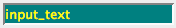
| <h:inputText value="inputText" style="color: Yellow;
background: Teal;"/> |
 |
| <h:inputText value="1234567" size="5"/> |
 |
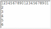
| <h:inputText value="1234567890" maxlength="6"
size="10"/> |
 |
Table 4–10 h:inputTextarea
Examples
| Example |
Result |
| <h:inputTextarea rows="5"/> |
 |
| <h:inputTextarea cols="5"/> |
 |
| <h:inputTextarea value="123456789012345" rows="3"
cols="10"/> |
 |
| <h:inputTextarea value="#{form.dataInRows}" rows="2"
cols="15"/> |
 |
Table 4–11 Attributes for h:outputText
and h:outputFormat
| Attribute |
Description |
| escape |
If set to true, escapes <, >, and & characters. Default
value is true. |
| binding, converter, id, rendered,
styleClass, value |
Basic attributes |
| style, title |
HTML 4.0 |
Attributes for h:outputLabel
| Attribute |
Description |
| for |
The ID of the component to be labeled. |
| binding, converter, id, rendered,
value |
Basic attributes |
Table 4–12 Attributes for
h:graphicImage
| Attribute |
Description |
| binding, id, rendered,
styleClass, value |
Basic attributes |
| alt, dir, height, ismap,
lang, longdesc, style, title,
url, usemap, width |
HTML 4.0 |
| onblur, onchange, onclick,
ondblclick, onfocus, onkeydown,
onkeypress, onkeyup, onmousedown,
onmousemove, onmouseout, onmouseover,
onmouseup |
DHTML events |
Table 4–13 h:outputText and
h:graphicImage Examples
| Example |
Result |
| <h:outputText value="#{form.testString}"/> |
 |
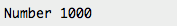
| <h:outputText value="Number #{form.number}"/> |
 |
| <h:outputText value="<input type=’text’
value=’hello’/>"/> |
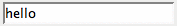 |
| <h:outputText escape="true" value="<input
type=’text’ value=’hello’/>"/> |
 |
| <h:graphicImage value="/tjefferson.jpg"/> |
 |
| <h:graphicImage value="/tjefferson.jpg" style="border: thin
solid black"/> |
 |
Table 4–14 h:commandButton
and h:commandLink
| Attribute |
Description |
| action |
If specified as a string: Directly specifies an outcome used by the
navigation handler to determine the JSF page to load next as a result
of activating the button or link If specified as a method binding: The
method has this signature: String methodName(); the string
represents the outcome |
| actionListener |
A method binding that refers to a method with this signature:
void methodName(ActionEvent) |
| charset |
For h:commandLink only—The character encoding of the
linked reference |
| image |
For h:commandButton only—A context-relative path to an
image displayed in a button. If you specify this attribute, the HTML
input’s type will be image. |
| immediate |
A boolean. If false (the default), actions and action listeners are
invoked at the end of the request life cycle; if true, actions and
action listeners are invoked at the beginning of the life cycle. See
Chapter 6 for more information about the immediate
attribute. |
| type |
For h:commandButton: The type of the generated input
element: button, submit, or reset. The default, unless you specify the
image attribute, is submit. For h:commandLink: The content
type of the linked resource; for example, text/html, image/gif, or
audio/basic |
| value |
The label displayed by the button or link. You can specify a string
or a value reference expression. |
| accesskey, alt, binding, id,
lang, rendered, styleClass,
value |
Basic attributes |
| coords (h:commandLink only), dir,
disabled (h:commandButton only), hreflang
(h:commandLink only), lang, readonly,
rel (h:commandLink only), rev
(h:commandLink only), shape (h:commandLink
only), style, tabindex, target
(h:commandLink only), title, type |
HTML 4.0 |
| onblur, onchange, onclick,
ondblclick, onfocus, onkeydown,
onkeypress, onkeyup, onmousedown,
onmousemove, onmouseout, onmouseover,
onmouseup, onselect |
DHTML events |
Table 4–15 h:commandButton
Examples
Table 4–16 h:commandLink
Examples
Table 4–17 Attributes for
h:outputLink
| Attribute |
Description |
| accesskey, binding, converter,
id, lang, rendered, styleClass,
value |
Basic attributes |
| charset, coords, dir, hreflang,
lang, rel, rev, shape,
style, tabindex, target, title,
type |
HTML 4.0 |
| onblur, onchange, onclick,
ondblclick, onfocus, onkeydown,
onkeypress, onkeyup, onmousedown,
onmousemove, onmouseout, onmouseover,
onmouseup |
DHTML events |
Table 4–18 h:outputLink
Examples
| Example |
Result |
| <h:outputLink value="http://java.net"> <h:graphicImage
value="java-dot-net.jpg"/> <h:outputText value="java.net"/>
</h:outputLink> |
 |
| <h:outputLink value="#{form.welcomeURL}"> <h:outputText
value="#{form.welcomeLinkText}"/> </h:outputLink> |
 |
| <h:outputLink value="#introduction"> <h:outputText
value="Introduction" style="font-style: italic"/>
</h:outputLink> |
 |
| <h:outputLink value="#conclusion" title="Go to the
conclusion"> <h:outputText value="Conclusion"/>
</h:outputLink> |
 |
| <h:outputLink value="#toc" title="Go to the table of
contents"> <f:verbatim> <h2>Table of Contents</h2>
</f:verbatim> </h:outputLink> |
 |
Table 4–19 Selection Tag Examples
| Tag |
Generated HTML |
Examples |
| h:selectBooleanCheckbox |
<input type="checkbox"> |
 |
| h:selectManyCheckbox |
<table> ... <label> <input type="checkbox"/>
</label> ... </table> |
 |
| h:selectOneRadio |
<table> ... <label> <input type="radio"/>
</label> ... </table> |
 |
| h:selectOneListbox |
<select> <option value="Cheese"> Cheese
</option> ... </select> |
 |
| h:selectManyListbox |
<select multiple> <option value="Cheese"> Cheese
</option> ... </select> |
 |
| h:selectOneMenu |
<select size="1"> <option value="Cheese"> Cheese
</option> ... </select> |
 |
| h:selectManyMenu |
<select multiple size="1"> <option value="Sunday">
Sunday </option> ... </select> |
 |
Table 4–20 Attributes for
h:selectBooleanCheckbox, h:selectManyCheckbox,
h:selectOneRadio, h:selectOneListbox,
h:selectManyListbox, h:selectOneMenu,
h:selectManyMenu
| Attribute |
Description |
| disabledClass |
CSS class for disabled elements—for h:selectOneRadio
and h:selectManyCheckbox only |
| enabledClass |
CSS class for enabled elements—for h:selectOneRadio
and h:selectManyCheckbox only |
| layout |
Specification for how elements are laid out: lineDirection
(horizontal) or pageDirection (vertical)—for
h:selectOneRadio and h:selectManyCheckbox only |
| binding, converter, id,
immediate, styleClass, required,
rendered, validator, value,
valueChangeListener |
Basic attributes |
| accesskey, border, dir, disabled,
lang, readonly, style, size,
tabindex, title |
HTML 4.0—border is applicable
to h:selectOneRadio and h:selectManyCheckbox only.
size is applicable to h:selectOneListbox and
h:selectManyListbox only. |
| onblur, onchange, onclick,
ondblclick, onfocus, onkeydown,
onkeypress, onkeyup, onmousedown,
onmousemove, onmouseout, onmouseover,
onmouseup, onselect |
DHTML events |
Table 4–21 Attributes for
f:selectItem
| Attribute |
Description |
binding, id |
Basic attributes |
| itemDescription |
Description used by tools only |
| itemDisabled |
Boolean value that sets the item’s disabled property |
| itemLabel |
Text shown by the item |
| itemValue |
Item’s value, which is passed to the server as a request
parameter |
| value |
Value binding expression that points to a SelectItem
instance |
Attributes for f:selectItems
| Attribute |
Description |
binding, id |
Basic attributes |
| value |
Value binding expression that points to a SelectItem, an
array or Collection of SelectItem objects, or a
Map mapping labels to values. |
Table 4–22 Attributes for
h:message and h:messages
| Attribute |
Description |
| for |
The ID of the component whose message is displayed—applicable
only to h:message |
| errorClass |
CSS class applied to error messages |
| errorStyle |
CSS style applied to error messages |
| fatalClass |
CSS class applied to fatal messages |
| fatalStyle |
CSS style applied to fatal messages |
| globalOnly |
Instruction to display only global messages—applicable only to
h:messages. Default: false |
| infoClass |
CSS class applied to information messages |
| infoStyle |
CSS style applied to information messages |
| layout |
Specification for message layout: table or list—applicable only
to h:messages |
| showDetail |
A boolean that determines whether message details are shown. Defaults
are false for h:messages, true for h:message. |
| showSummary |
A boolean that determines whether message summaries are shown.
Defaults are true for h:messages, false for
h:message. |
| tooltip |
A boolean that determines whether message details are rendered in a
tooltip; the tooltip is only rendered if showDetail and
showSummary are true |
| warnClass |
CSS class for warning messages |
| warnStyle |
CSS style for warning messages |
| binding, id, rendered,
styleClass |
Basic attributes |
| style, title |
HTML 4.0 |
Table 4–23 Attributes for
h:panelGrid
| Attribute |
Description |
| bgcolor |
Background color for the table |
| border |
Width of the table’s border |
| cellpadding |
Padding around table cells |
| cellspacing |
Spacing between table cells |
| columnClasses |
Comma-separated list of CSS classes for columns |
| columns |
Number of columns in the table |
| footerClass |
CSS class for the table footer |
| frame |
frame Specification for sides of the frame surrounding the table that
are to be drawn; valid values: none, above,
below, hsides, vsides, lhs,
rhs, box, border |
| headerClass |
CSS class for the table header |
| rowClasses |
Comma-separated list of CSS classes for columns |
| rules |
Specification for lines drawn between cells; valid values:
groups, rows, columns, all |
| summary |
Summary of the table’s purpose and structure used for
non-visual feedback such as speech |
| binding, id, rendered,
styleClass, value |
Basic attributes |
| dir, lang, style, title,
width |
HTML 4.0 |
| onclick, ondblclick, onkeydown,
onkeypress, onkeyup, onmousedown,
onmousemove, onmouseout, onmouseover,
onmouseup |
DHTML events |
Table 4–24 Attributes for
h:panelGroup
Table 5–1 Attributes for
h:dataTable
| Attribute |
Description |
| bgcolor |
Background color for the table |
| border |
width of the table's border |
| cellpadding |
Padding around table cells |
| cellspacing |
Spacing between table cells |
| columnClasses |
comma-separated list of CSS classes for columns |
| first |
index of the first row shown in the table |
| footerClass |
CSS class for the table footer |
| frame |
Specification for sides of the frame surrounding the table should be
drawn; valid values: none, above, below,
hsides, vsides, lhs, rhs,
box, border |
| headerClass |
CSS class for the table header |
| rowClasses |
comma-separated list of CSS classes for rows
|
| rules |
Specification for lines drawn between cells; valid values:
groups, rows, columns, all |
| summary |
summary of the table's purpose and structure used for non-visual
feedback such as speech |
| var |
The name of the variable created by the data table that represents
the current item in the value |
| binding, id, rendered,
styleClass, value |
Basic attributes |
| dir, lang, style, title,
width |
HTML 4.0 |
| onclick, ondblclick, onkeydown,
onkeypress, onkeyup, onmousedown,
onmousemove, onmouseout, onmouseover,
onmouseup |
DHTML events |
Attributes for h:column
| Attribute |
Description |
| headerClass (JSF 1.2) |
CSS class for the column's header |
| footerClass (JSF 1.2) |
CSS class for the column's footer |
| binding, id, rendered |
Basic attributes |
Table 6–1 Attributes for
f:convertNumber
| Attribute |
Type |
Value |
| type |
String |
number (default), currency , or
percent |
| pattern |
String |
Formatting pattern, as defined in
java.text.DecimalFormat |
| maxFractionDigits |
int |
Maximum number of digits in the fractional part |
| minFractionDigits |
int |
Minimum number of digits in the fractional part |
| maxIntegerDigits |
int |
Maximum number of digits in the integer part |
| minIntegerDigits |
int |
Minimum number of digits in the integer part |
| integerOnly |
boolean |
True if only the integer part is parsed (default: false) |
| groupingUsed |
boolean |
True if grouping separators are used (default: true) |
| locale |
java.util.Locale |
Locale whose preferences are to be used for parsing and
formatting |
| currencyCode |
String |
ISO 4217 currency code to use when converting currency values |
| currencySymbol |
String |
Currency symbol to use when converting currency values |
Table 6–2 Attributes for
f:convertDateTime
| Attribute |
Type |
Value |
| type |
String |
date (default), time, or both |
| dateStyle |
String |
default, short, medium, long, or
full |
| timeStyle |
String |
default, short, medium, long, or
full |
| pattern |
String |
Formatting pattern, as defined in
java.text.SimpleDateFormat |
| locale |
java.util.Locale |
Locale whose preferences are to be used for parsing and
formatting |
| timeZone |
java.util.TimeZone |
Time zone to use for parsing and formatting |
Table 6–3 Standard Validators
| JSP Tag |
Validator Class |
Attributes |
Validates |
| f:validateDoubleRange |
DoubleRangeValidator |
minimum, maximum |
a double value within an optional range |
| f:validateLongRange |
LongRangeValidator |
minimum, maximum |
a long value within an optional range |
| f:validateLength |
LengthValidator |
minimum, maximum |
a String with a minimum and maximum number of characters |
Attributes for f:view
| Attribute |
Description |
| locale |
The locale for this view. |
| renderKitId (JSF 1.2) |
The render kit ID for this view |
| beforePhase, afterPhase |
Phase listeners that are called in every phase except "restore
view" |
Attributes for f:subview
Attributes for f:facet
| Attribute |
Description |
| name |
The name of this facet. |
Attributes for f:attribute
| Attribute |
Description |
| name |
The name of the attribute to set. |
| value |
The value of the attribute. |
Attributes for f:param
| Attribute |
Description |
| name |
An optional name for this parameter component. |
| value |
The value stored in this component. |
| binding, id |
Basic attributes |
Attributes for
f:actionListener, f:valueChangeListener
| Attribute |
Description |
| type |
The name of the listener class |
Attributes for
f:propertyChangeListener
| Attribute |
Description |
| target |
The bean property to set when the action event occurs |
value |
The value to set it to |
Attributes for f:converter
| Attribute |
Description |
| converterId |
The ID of the converter |
Attributes for f:validator
| Attribute |
Description |
| validatorId |
The ID of the validator |
Attributes for f:loadBundle
| Attribute |
Description |
| basename |
The resource bundle name |
| value |
The name of the variable that is bound to the bundle map |
Attributes for f:verbatim
| Attribute |
Description |
| escape |
If set to true, escapes <, >, and & characters. Default
value is false. |
| rendered (JSF 1.2) |
Basic attributes |